Have you ever wondered how a game goes from prototype to finished product? Before all of the fancy graphics and animations are added, before all of these incredibly detailed inter-woven systems work together, how does a game look?
Today we’re going to talk about the journey we’ve taken with Silicon Dreams; how it has already changed and how it may change before the game is done.
The Prototype
It’s only been 6 months and the game has already changed so much that it’s nearly unrecognizable. Game development is not a linear process after all: it’s an iterative one. Develop a prototype, test it to evaluate whether it functions how you want, tweak anything that doesn’t work, and repeat the process until the game is finished.

Maybe we should have just stuck with the default Unity world?
This is the earliest prototype of Silicon Dreams: a simple setup to test the most basic functionality of the game. All the main components of the current version are already here: the bio is lying in the bottom left of the screen, the report is front and center, and in the bottom right we can already see the emotion machine (albeit with more emotions and *much* more color). In this version the machine itself doesn’t even say what emotions it measures: the player character has stuck a handful of sticky notes on it as an aide-memoire.
Despite its simplicity, this basic implementation was enough to let us test how the game worked and to recognize the things that weren’t working as we wanted. After this version we had a number of discussions about how best to present information to players and how to incorporate the mechanics of the emotion machine into the conversation mechanics.
Even at this early stage, we felt there was just too much happening on-screen. To simplify we ended up merging the report and the bio into a single device with tabs for navigation. We also scrutinized the emotion machine, and decided to cut two of the emotions entirely. Amazement was changed to Surprise, and Disgust and Fascination didn’t make the cut.
Prototype v2
After those changes, we had this:

The androids like this version the most…
we didn’t have wrist restraints in the game yet.
In this iteration, aside from the obvious visual changes (modeling the player’s room, actually having a video feed of the subject, etc.) it’s easy to see that there are some other, less obvious changes. The first iteration of the tablet, mentioned above, is already in the game, as is a new and improved emotion machine in a brand new location! (though this will change again before this post is over 😛 )
Of course, visual design changes weren’t the only changes we made. We had our first prototype characters at this point and were able to more closely observe how the subjects interacted with the mechanics of the game. A lot of things changed at this point, including the way we concepted and planned characters even before the writing had begun.
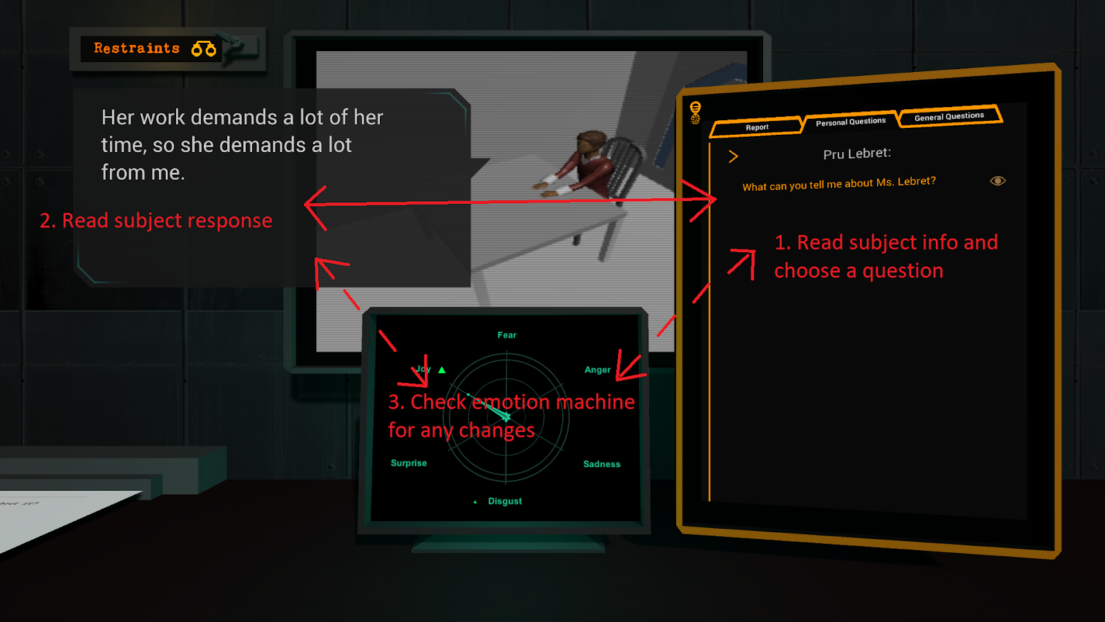
Current demo version

I’ve got cyberpunk fever, and the only prescription is more neon!
Finally, we arrive at the currently available demo version that we all know and love! As promised, the emotion machine moved again, this time smack dab in the middle. The tablet was then relocated to the right, and dialogue now appears to the left.
Why the need for all these changes?
Over the course of testing our game, we noticed that critical information was being ignored simply because it wasn’t in the right place on the screen. By putting the emotion machine all the way to the left corner, it was never natural for them to glance at it. We realised that simply by having inefficient sight-lines, we were making it strangely difficult for players to absorb key information.. When a subject answers a question but their emotions say something entirely different? That’s a critical moment and one that should be impossible to miss!

To address this, we simply moved some things around the screen. By framing the scene with the two things the player looks at most: the tablet and the dialogue, the emotion machine was now much more prominent. As the beautiful diagram above shows, this loop that the player’s eye forms now includes the information about their subject’s emotional state.
These budget graphics proudly brought to you by MS Paint
This is just a taste of the changes that have been made to Silicon Dreams so far; there are many more to come! This is certainly not the final layout as we’ve since received some amazing feedback that we’ll have to consider how to best implement.
Have you played the demo of our game? What were your thoughts; was it easy to follow the flow of information or did things feel a bit off?
Thanks for joining us on this brief dive into the design of Silicon Dreams. The Kickstarter is still underway, so if you haven’t taken a look at that yet, please do. We’ll be back again soon with another blog post so keep checking those inboxes!